A nostalgic fairytale for adults
As illustrator and book designer, I surround myself with wonderful books with beautiful illustrations by which I love to be inspired.
I think it is even safe to say that I am very greedy when it comes to books. I would love to share with you what it is in them that appeals to me so greatly. This time: a beautiful picture book by Merlijne Marell published by Uitgeverij Loopvis.
Refined
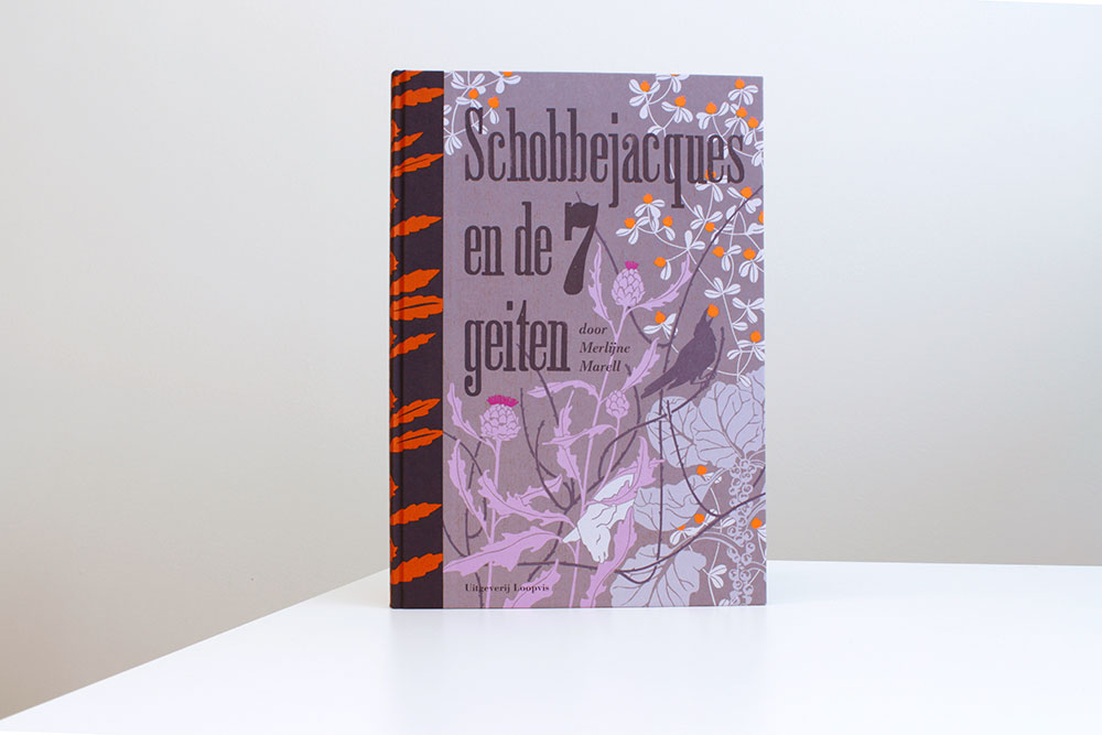
The first thing I notice when I get the book ‘Schobbejacques en de 7 geiten’ from the mail package, is its size. Bigger than A4, with a firm cover. The author, illustrator and designer Merlijne Marell gives herself all the space she needs to convey her vision. The cover alone is like a painting with beautiful hues; purple shades with an orange accent and a refined shape language of plant and animal figures. A cover that you would like to just place somewhere in the room to look at and discover new things everything you observe it. The book is bound in a hardcover with linen back, in which every band has been given a screen print by Merlijne herself.
Subtle
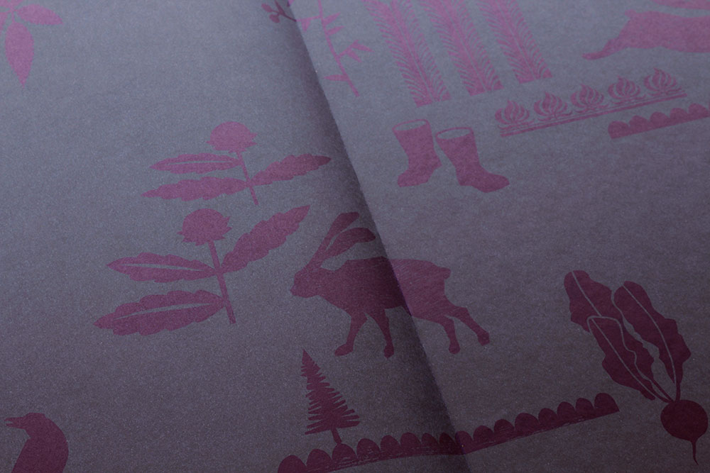
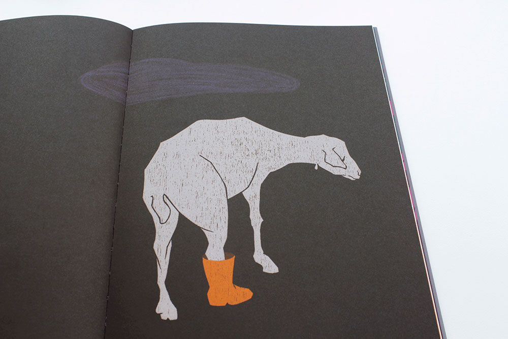
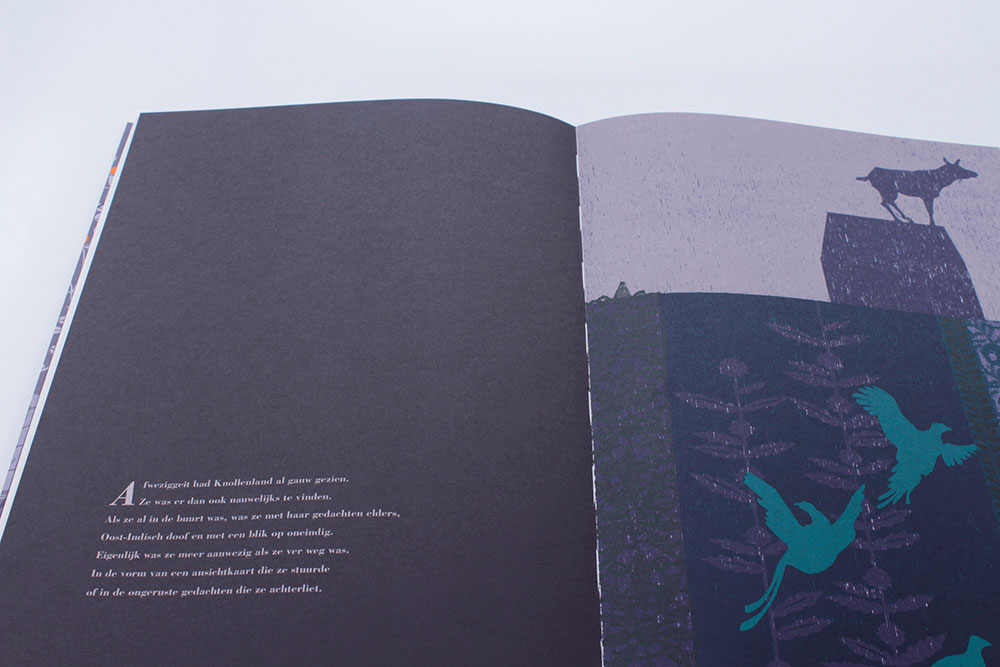
The tone she uses for the cover, ambient and poetic, is continued in the inside of the book. The dark blue bracts have dark purple shapes of animals and plants printed on them. Subtly, they show themselves. The pages of the inside are firm, with exactly the right shade of white, not too blue and not too yellow. It is uncoated (matte) paper, giving it a very tactile touch. The ambient illustrations with deep colors look amazing on this surface and size.
Layered
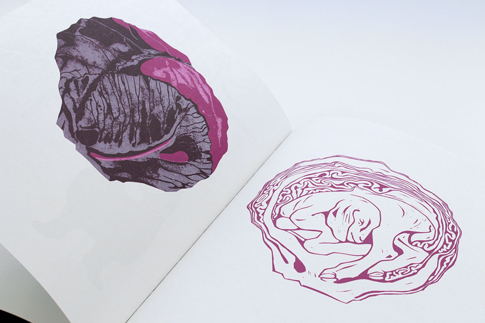
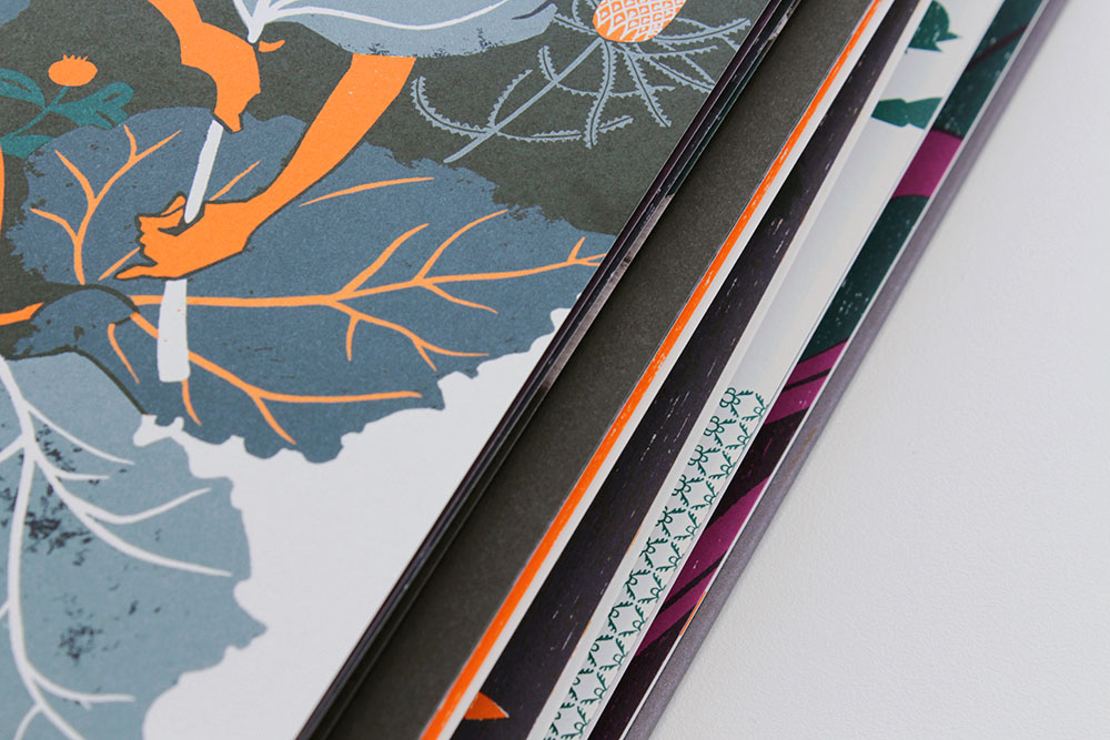
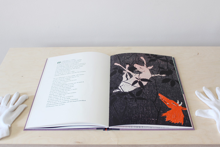
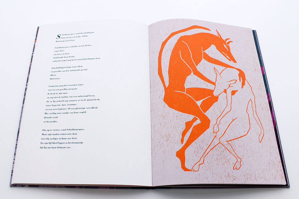
In the inside, green and black are added in addition to the warm shades of the cover. This makes it a rich ensemble. For the layered illustrations, a combined technique of screen printing, linocuts and woodcut has been used. So careful and with attention to detail.
And the typography is flawless as well. The title on the cover and the cover sheet is typeset in an unknown wooden font, as described in the colophon and the other texts are typeset in the Bodoni. Both fonts induce a nostalgic feeling with a dash of retro. This accent perfectly matches the contents and illustrations.
Quirky
The story is beautiful, lightly based on a Grimm fairytale. The use of quirky Dutch words (that completely get lost in translation) and the name of the goats, such as ‘Schobbejacques’, ‘Sikkeneuriggeit’, ‘Afweziggeit’ and ‘Hebberiggeit’ feel very ancient Dutch. It reminds me of the children’s songs from my childhood. But that is only something that the Dutchies among us will recognize. The book has yet to be published in other languages.
Still I think that, even if you don’t read Dutch, there is much to find and enjoy in the book. Everything has been touched and every detail has been carefully thought out.
A beautiful picture book for adults, that you just have to grab and browse through time after time, as you read it and are amazed by it. A true work of art.
‘Schobbejacques en de 7 geiten’ was one of the ‘Best Verzorgde Boeken’ (honorary Dutch title) of 2015.
The book can be ordered at Uitgeverij Loopvis or at Merlijne Marell’s website.
Geen reacties